You Can (and do) Judge a Book by its Cover
This chestnut of the publishing industry is instinctive for readers. We walk past the bookshelf at a supermarket or airport bookstore and our eye scans dozens of images before they are drawn to one that we seek. If you are looking for military action adventure, your subconscious will reject the pastel colors (flesh tones?) and soft fonts of romance novel covers and pass them by, looking for bold colors and sharp fonts that invoke machines and danger. Our brains filter for us in nanoseconds, and retailers help us by organizing their shelves for our tastes.
Research shows that a bookstore browser will spend eight seconds evaluating a cover; on line this is less, and a literary agency has a policy of three seconds for the cover to “grab” them before they pass. On your mobile device the cover image is 58 pixels square. The cover, and title, must be effective and hold attention for over three seconds.
I knew Raven One was a good title; I think Hollywood co-opted it for Rogue One, but let’s move on. My vision for the cover was a FA-18 Hornet silhouetted by a setting – or rising – sun. This would invoke drama, purpose, an image of a menacing fighter high above. That image and a cool title would convey to the reader that this book is about fighter combat. It is about much more, but a simple yet striking image would push people to give an unknown author a chance. There are plenty of terrific images on Google and my gut told me they are not for the taking. Later research confirmed they are not.
My publisher Jeff Edwards asked me if I had a cover design, and I sent him this:
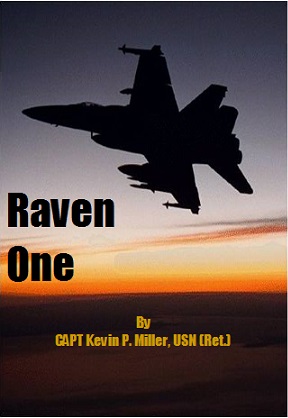
He hated it.
He had me go to 99Designs and hold a “book cover contest.” After giving guidance, 99Designs then put the word out to designers around the world and within hours I had dozens of designs to choose from, and over the next several days, hundreds. Holding on to my original vision for the cover, I directed the designers toward it. I then made what may have been a tactical error.
99Designs allows contest holders to conduct a poll, and so I asked people in my circle, from all walks of life, to comment on a short-list of designs I thought had merit. My hope for Raven One is that it can appeal to all, and it can, but it is certainly in the military action-adventure thriller genre. I’ve read novels from westerns to young adult to romance to mysteries to techno-thrillers, and if people that prefer these genres read just one military action novel in their life, my hope was and remains that it would be mine. The comments I got were all over the place, and the cover I preferred was not among the top two. It was a struggle, and after agonizing for days I went with Dima Li, of Kiev, Ukraine.
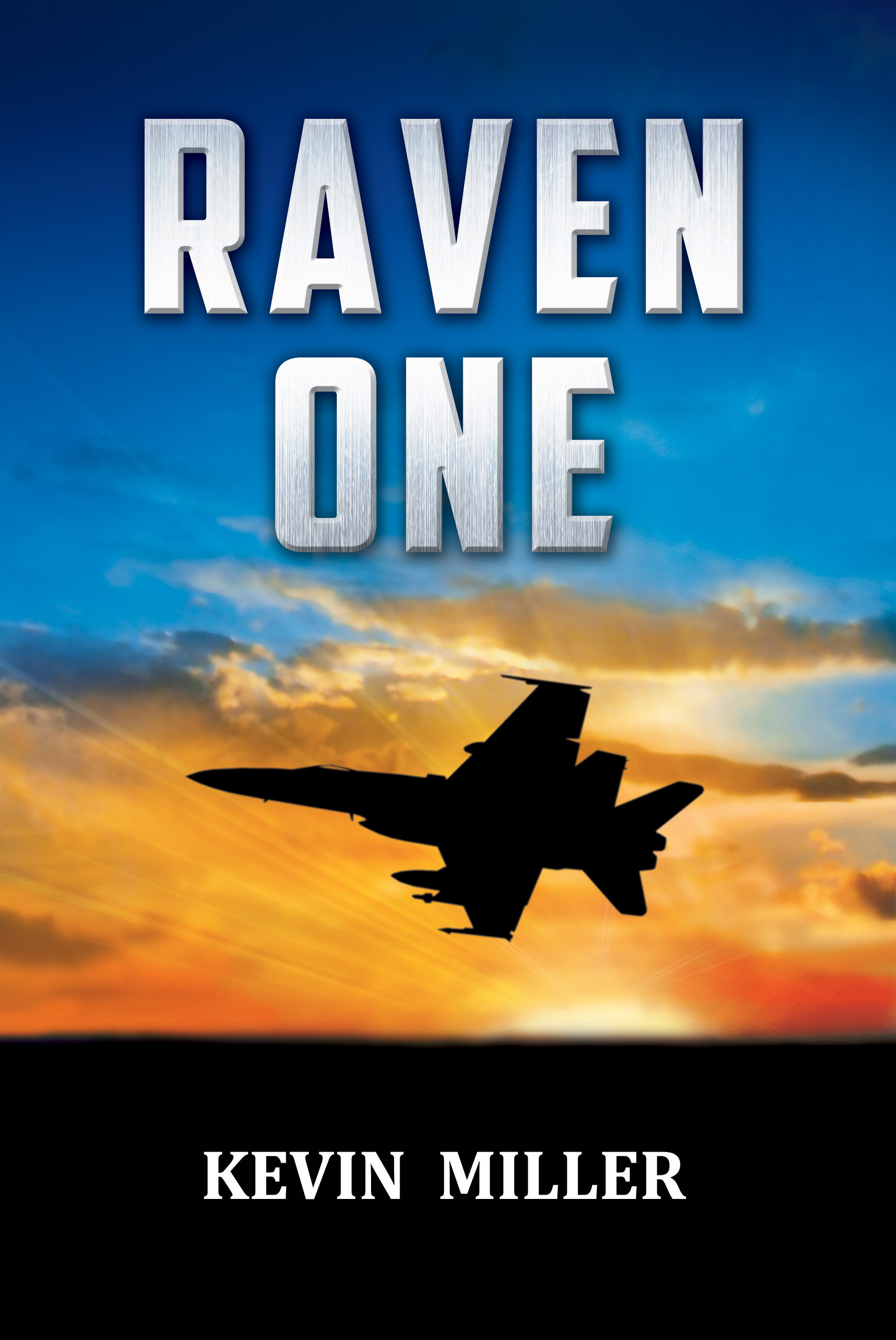
This cover showed a single jet in an angle of bank with weapons on the wings, dark and mysterious, with a dramatic sky. The reader knows this is book is going to be about modern fighter combat, and the title font is powerful, my name is simple. It was an effective cover; Raven One has sold over 20,000 copies in all formats over three years, rising to the Top 100 of all Kindle Paid and all Kindle Free.
Through reviews and feedback I’ve learned that 80% of my readers are male. And they skew older – frankly this is the future of publishing with fewer and fewer readers each year as fewer and fewer young people turn to it as a form of entertainment. My books convey to the reader what it is like in today’s military and explain geopolitical realities in a way that entertains without overwhelming, but after giving copies to young readers with heartfelt requests to give it a try – with few exceptions they do not.
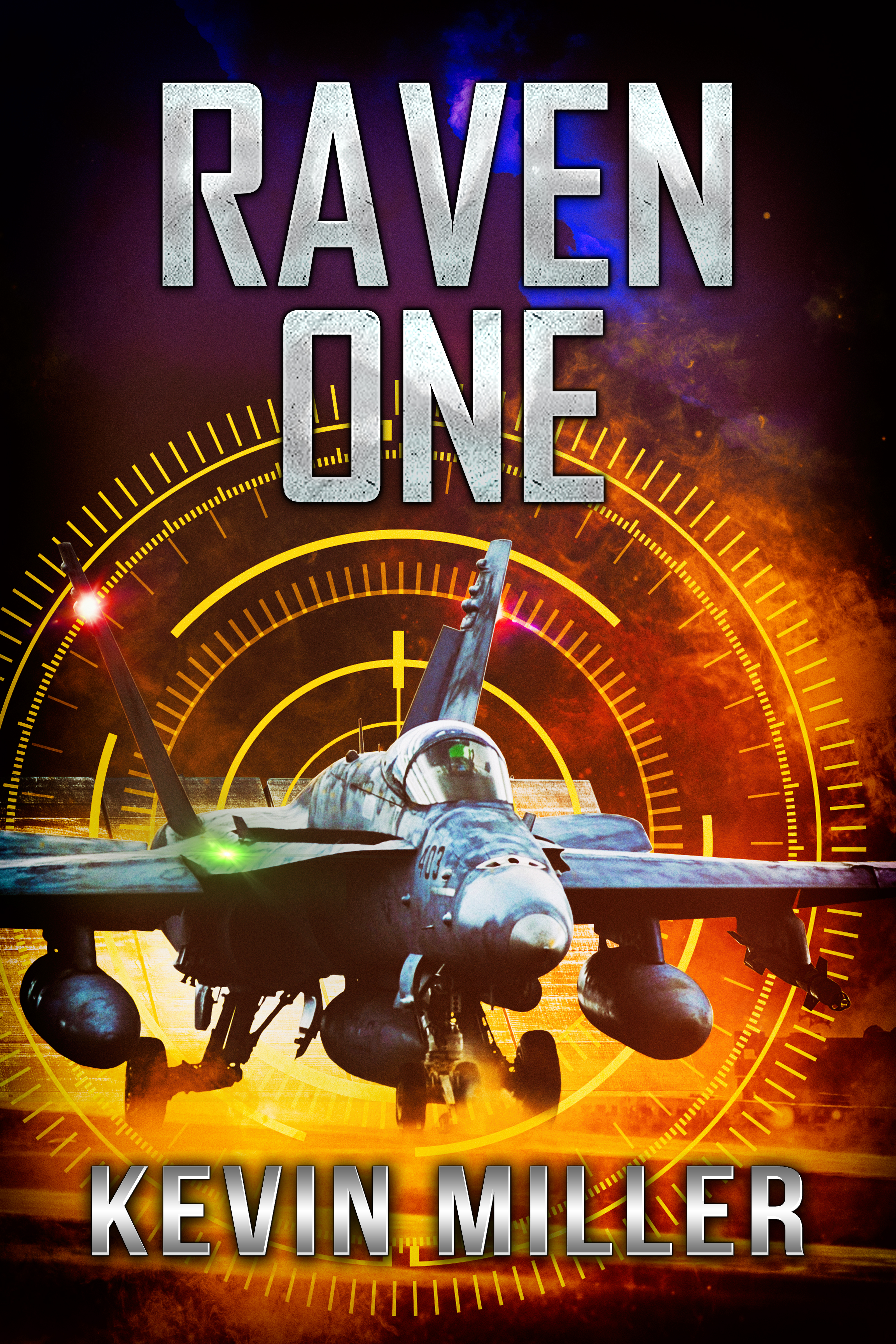
So when it became time to update Raven One’s cover to make it more alluring to the next level – read Hollywood and video game designers – we knew we had to go with the ones who brought, or bought, us. Braveship’s Jeff Edwards, an accomplished military techno-thriller author, thought the R1 cover was like an airline brochure but he shrugged his shoulders and let me choose. This time I brought Jeff in on the process. Once again holding a contest with 99Designs, together we put down the guidelines for the designers. This book is about aircraft carrier aviation with lots of drama and action. We envisioned a dramatic night carrier catapult launch, with energy, power, mystery, danger. We wanted a powerful font, and one that we can use for future books as a brand. We began our contest and the designs came in, but much slower than three years ago. The designers did not seem to be reading the detailed brief, and the quality out of the gate was lower than expected. Alarmed, I extended the contest and 99Designs could not have been nicer in accommodating my requests. They were impressed that four master designers and three excellent ones were competing. That made me feel a little better, but it was also troubling with the low numbers of designs. The contest progressed and this time Jeff and I did not conduct a poll, but if we did we would have requested input from people in our circles who actually read military genre fiction. The question is simple: would you buy this book?
After the first round we identified designer ZamajK as a dark horse with potential, and he was most receptive in tweaking his design to meet our requests. He came on strong, and his Photoshop talents are remarkable. Below is his winning cover. To convey the dazzling white afterburner behind the jet, he illuminated the jet blast deflector, and did a terrific job with the aircraft external lights. The steam swirling about also conveys the power of the launch, and the night sky invokes drama. The “targeting reticle” suggests combat, and you can just feel the jet hurtling down the track…where is it going? What will happen next? Raven One is a multi-faceted story of men and women in a carrier fighter squadron, a story of jealousy and resentment, determination and courage, but you only get one cover image to draw people in for over three seconds. ZamajK, who is from Sweden, produced a cover that can increase the understanding of what Raven One is about.
Now, the cover of Declared Hostile shows a Super Hornet shooting a Maverick missile at a boat in broad daylight. What is going on with that? Actually, a better question is; would you buy the book?
2 Comments